This post may contain affiliate links, which means we may earn a small commission if you make a purchase through our links, at no extra cost to you. This helps us keep creating great content. Thank you for your support!
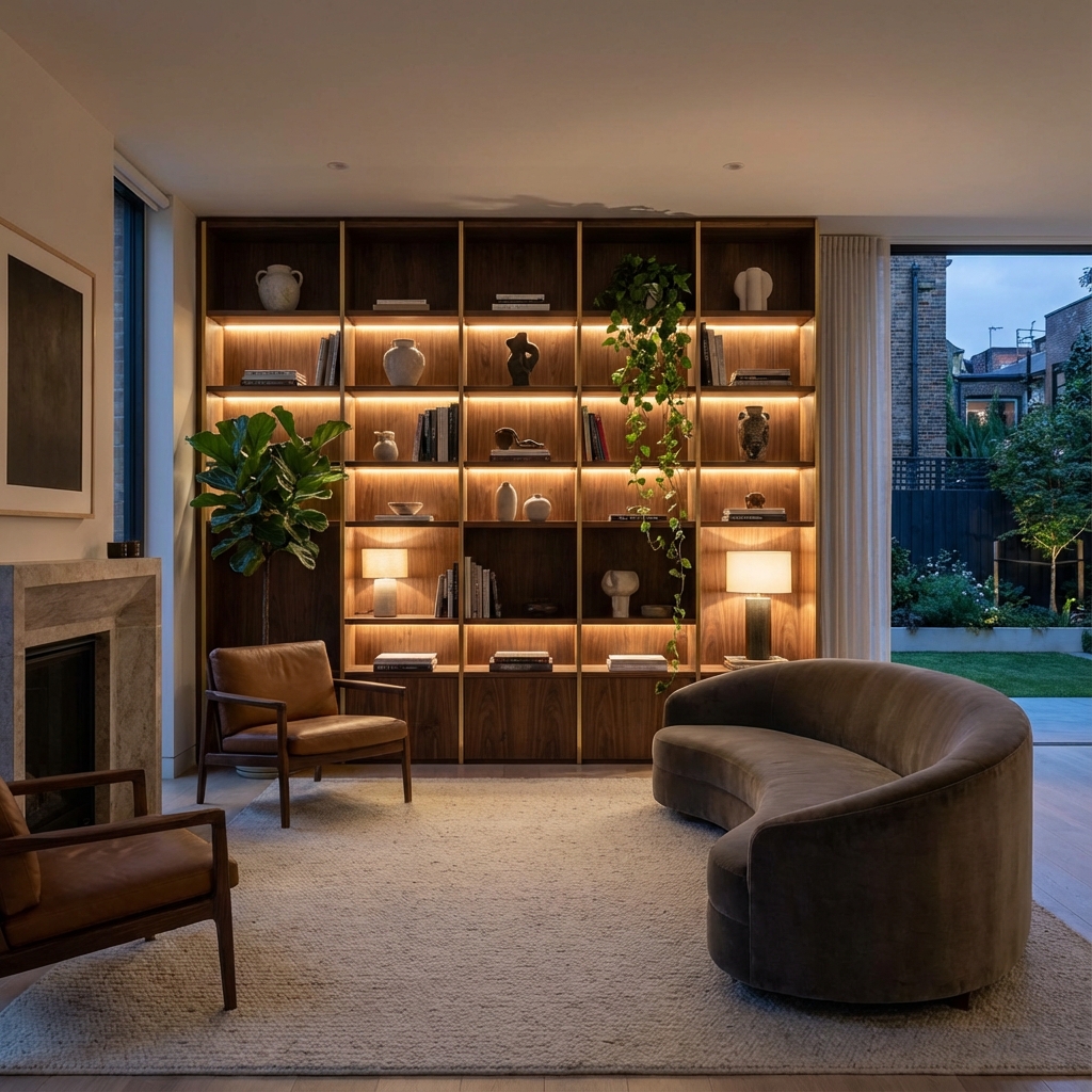
Is your bookshelf a storage unit or a focal point? Most people treat shelves as dumping grounds. But with a few professional secrets, you can turn unruly stacks into a magazine-worthy vignette.
We have compiled the Ultimate A-Z Designer's Glossary. This guide is designed to be your cheat sheet. Whether you are styling a "Dark Academia" library or a minimalist floating shelf, these are the rules the pros use.
The 3 Golden Rules of Styling
Before you dive into the A-Z, memorize these three principles. They save you from 90% of styling errors.
- The Rule of Thirds: Visually divide your shelf into three vertical sections. Never center everything perfectly; offset items to the left or right third to create energy.
- Triangulation: Place repeating colors (like gold or green) in a triangle shape across the shelves (e.g., Top Left, Middle Right, Bottom Center). This forces the eye to travel.
- Edit Relentlessly: Negative space is not "empty"; it is "active." If a shelf feels cluttered, remove 20% of the items.
A: Anchor Pieces
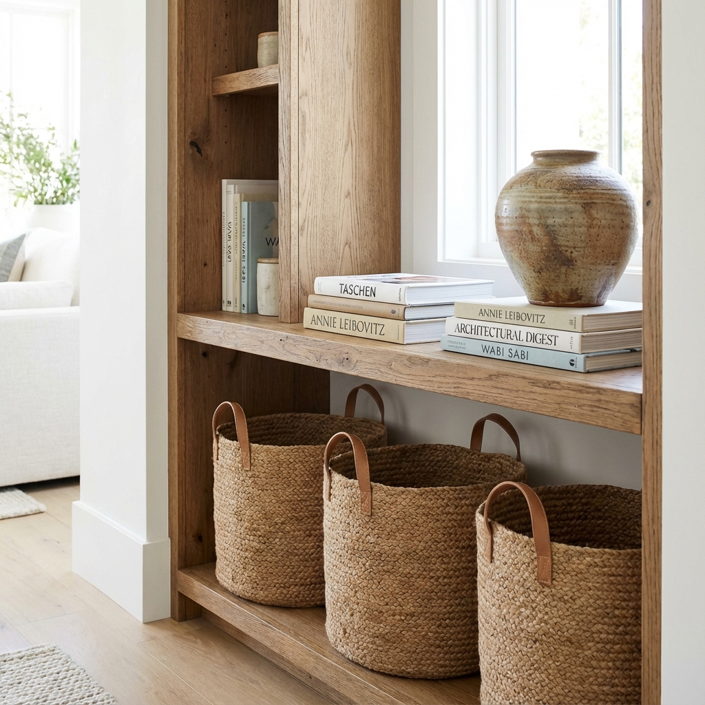
Visual Gravity: Place your heaviest items (both visually and physically) on the bottom shelf to ground the entire composition.
Definition: Large, voluminous items placed on the lowest shelves to provide a visual foundation.
Pro Design Tip: Avoid the "top-heavy" look. If you place small trinkets on the bottom and large vases on top, your room will feel unstable. Use large woven baskets (great for hiding cords), oversized coffee table books stacked horizontally, or pottery vases as your anchors.
B: Balance (Symmetrical vs. Asymmetrical)
The Problem: "My shelves look chaotic."
The Solution: You are missing balance.
- Symmetrical Balance: Identical vases on either side of a central stack. Best for formal, traditional spaces (and easier for beginners).
- Asymmetrical Balance: A tall plant on the left balanced by a wide stack of books on the right. Best for modern spaces. It feels organic but requires checking visual "weight."
C: Color Palette & Coding
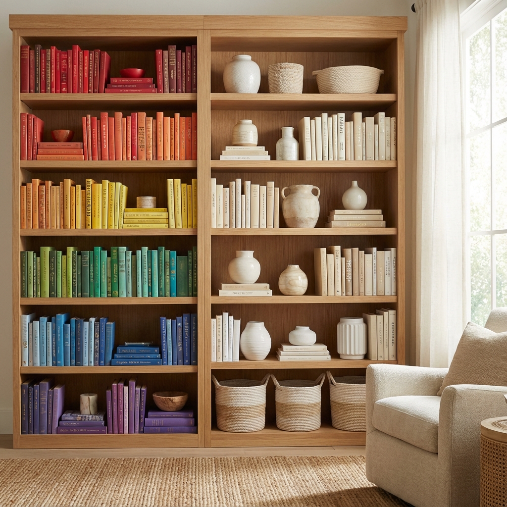
Left: The "Rainbow Method" for maximalists. Right: The "Neutral Edit" for a calming aesthetic.
The Designer's Secret: If you love colorful books but hate the chaos, use the "Wrap & Flip" method. Flip dust jackets inside out (they are often plain white) or wrap books in uniform craft paper.
The 60-30-10 Rule: 60% Neutral (books, walls), 30% Secondary (green plants, wood tones), 10% Accent (brass, black steel).
D: Depth & Dimension
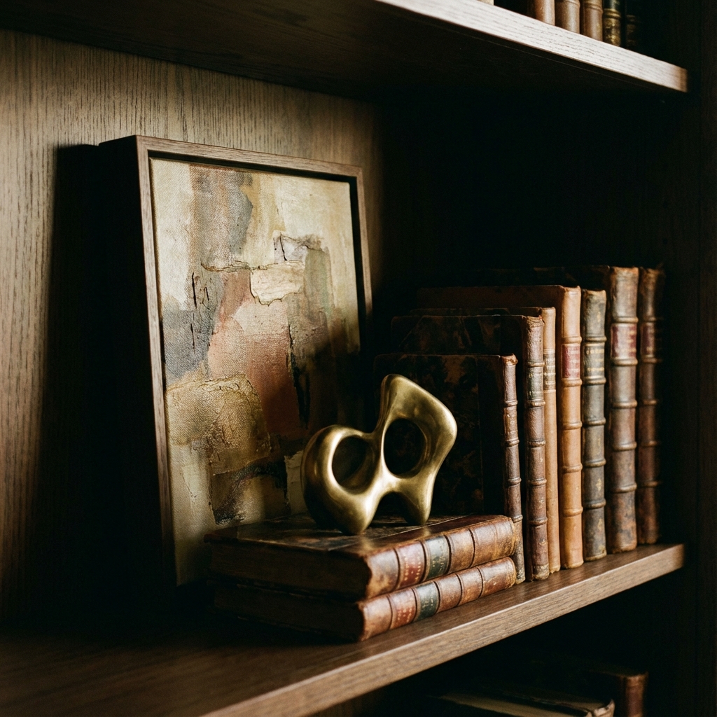
The "Rule of Overlap": Leaning art behind books and placing a sculpture in front creates a rich, 3D vignette.
Practical Tip: Treat the back 2 inches of your shelf as a display zone. Lean a small framed print or postcard there. Then, place your books. Finally, place a small object in the front 2 inches. This triple-layer effect mimics high-end retail displays.
E: Editing & Empty Space
The 80% Rule: Fill your shelves to only 80% capacity. The remaining 20% is "negative space" which allows the eye to rest and makes the objects look curated, not cluttered. If in doubt, take one thing away.
F: Floating Shelves
Installation Cheat Sheet:
- Standard Spacing: 12 inches (good for paperbacks).
- Modern Spacing: 15-18 inches (good for decor & vases).
- Above Desk: Mount the first shelf 18-24 inches above the desk surface.
G: Greenery & Biophilia
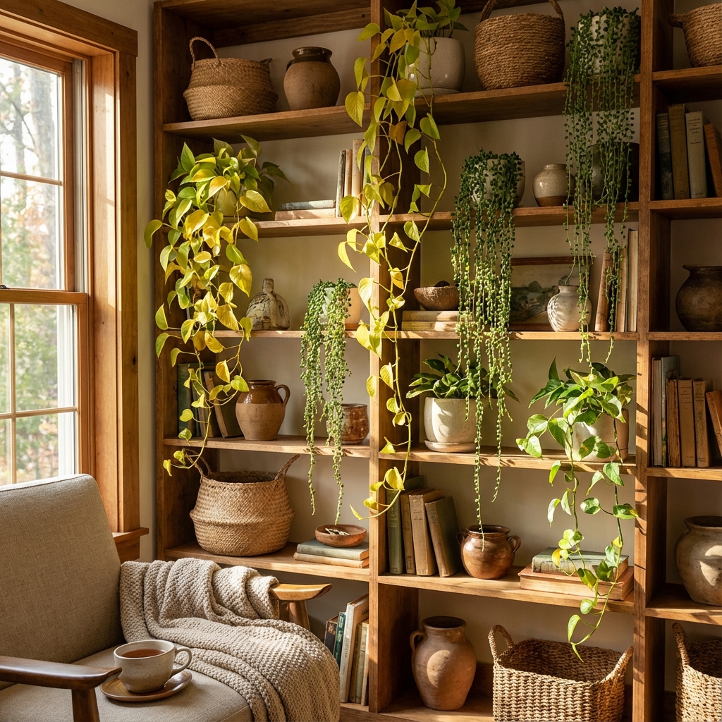
Softening the Grid: Organic, trailing plants break up the rigid horizontal and vertical lines of bookcases.
Plant Picks for Every Level:
- High Shelves: Golden Pothos or String of Hearts (trailing/dramatic).
- Eye Level: Zamioculcas (ZZ Plant) or Snake Plant (structural/vertical).
- Low Shelves: Faux plants (if light is low) or low-maintenance succulents.
H: Horizontal Stacking
Why do it? Vertical books read as "library." Horizontal stacks read as "display." Use horizontal stacks to act as bookends for vertical rows, or as a plinth to elevate a small sculpture.
I: Integrated Lighting
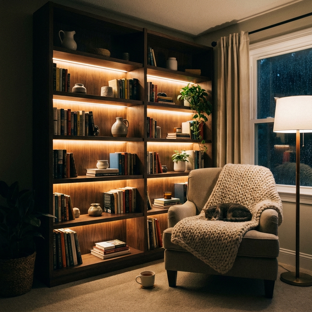
Layered Light: Functional lighting makes text readable; ambient lighting (like LED strips) creates mood.
The "No-Wire" Trick: You don't need an electrician. Use rechargeable, magnetic puck lights adhered to the underside of shelves. They come with remotes and transform a generic Ikea Billy casing into a custom built-in look.
J: "Just Because" Items
Your home is not a catalogue. It must contain personal artifacts. A jar of sea glass, a grandmother's camera, or a ticket stub in a frame. These "soul objects" prevent the design from feeling sterile.
K: Kids' Rotating Zones
For families, the "Design Mullet": Business on top (styled decor), Party on the bottom (kid's bins). Or, specialized rotating storage:
L: Library Wall
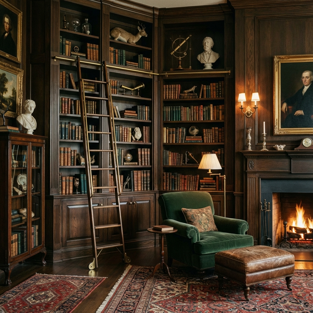
The "Dark Academia" Look: Floor-to-ceiling shelves, rich wood tones, and distinct lack of negative space creates a cozy, enveloping feel.
Get the Look for Less: You don't need custom joinery. Place multiple tall bookcases (like the Billy or Pax) side-by-side. Add baseboard molding to the bottom and crown molding to the top to fake a built-in appearance.
M: Maximalism (Curated)
Maximalism isn't mess; it's abundance. To pull this off, group collections together. Put all your vintage cameras on one shelf, all your globe collection on another. Repetition turns clutter into a "collection."
N: Negative Space
See 'E' for Editing. Negative space is the pause between the notes that makes the music.
O: Organization Tools
Hide the ugliest items (receipts, chargers) in the most beautiful boxes. Leather, linen, or wood boxes are worth the investment.
P: Paint & Paper
Renter Hack: Use peel-and-stick wallpaper on the backing board of your bookshelf to add pattern without damaging walls. A subtle linen texture or bold floral can change the entire room.
Q: Quirky Finds
Hunt for the "weird." A brass magnifying glass, a wooden mannequin hand, or an hourglass.
R: Rhythm & Repetition
Repeat materials. If you have a brass bowl on the top left, place a brass frame on the middle right, and a brass candlestick on the bottom left. This carries the eye through the shelf.
S: The S-Curve (Styling Flow)
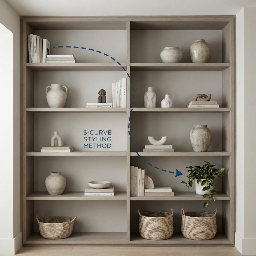
The S-Curve Method: Note how the eye travels from the top-left books, down to the middle-right vase, sweeping back to the left. This prevents the eye from getting "stuck".
The Pro Secret: Never stack all your heavy items on one vertical side. Distribute visually heavy items (dark books, black vases) in a zig-zag or "Z" pattern down the shelf. This forces the viewer's eye to travel the full height of the unit.
T: The Toolkit
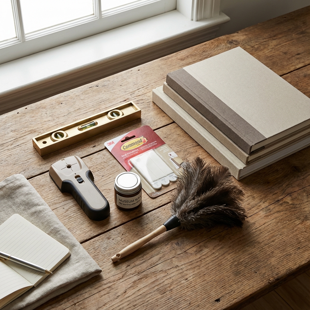
The Stylist's Kit: Don't start styling without these essentials.
Must-Have Tools:
- Museum Wax: A clear wax that secures breakables to the shelf (essential for earthquakes or kids/pets).
- Stud Finder: For safety when anchoring.
- Loop & Hook Tape: For managing cables behind books.
- Bubble Level: To ensure your "straight" lines are actually straight.
U: Utility Management
Drill holes in the backing board behind books to pass charging cables through. It's a 5-minute hack that makes a shelf functional for smart speakers.
V: Varying Heights
The Cityline Concept: Your shelf should look like a city skyline—high, low, high, low. Never allow a "flat" shelf. Use books as risers to lift small objects up.
W: Wall Mounting Safety
Mandatory Steps: Always anchor shelves taller than 30 inches. Use a magnetic stud finder to locate the beam, and use straps or L-brackets.
X: The X-Factor
The element of surprise. Hang a small wreath on the front of the shelves. Lean a small mirror to reflect light. Break the grid.
Y: You
Your bookshelf is a mirror of your interests. If it looks like a hotel lobby, you've over-styled it. Add the weird, the broken, the sentimental.
Z: Zen Zones
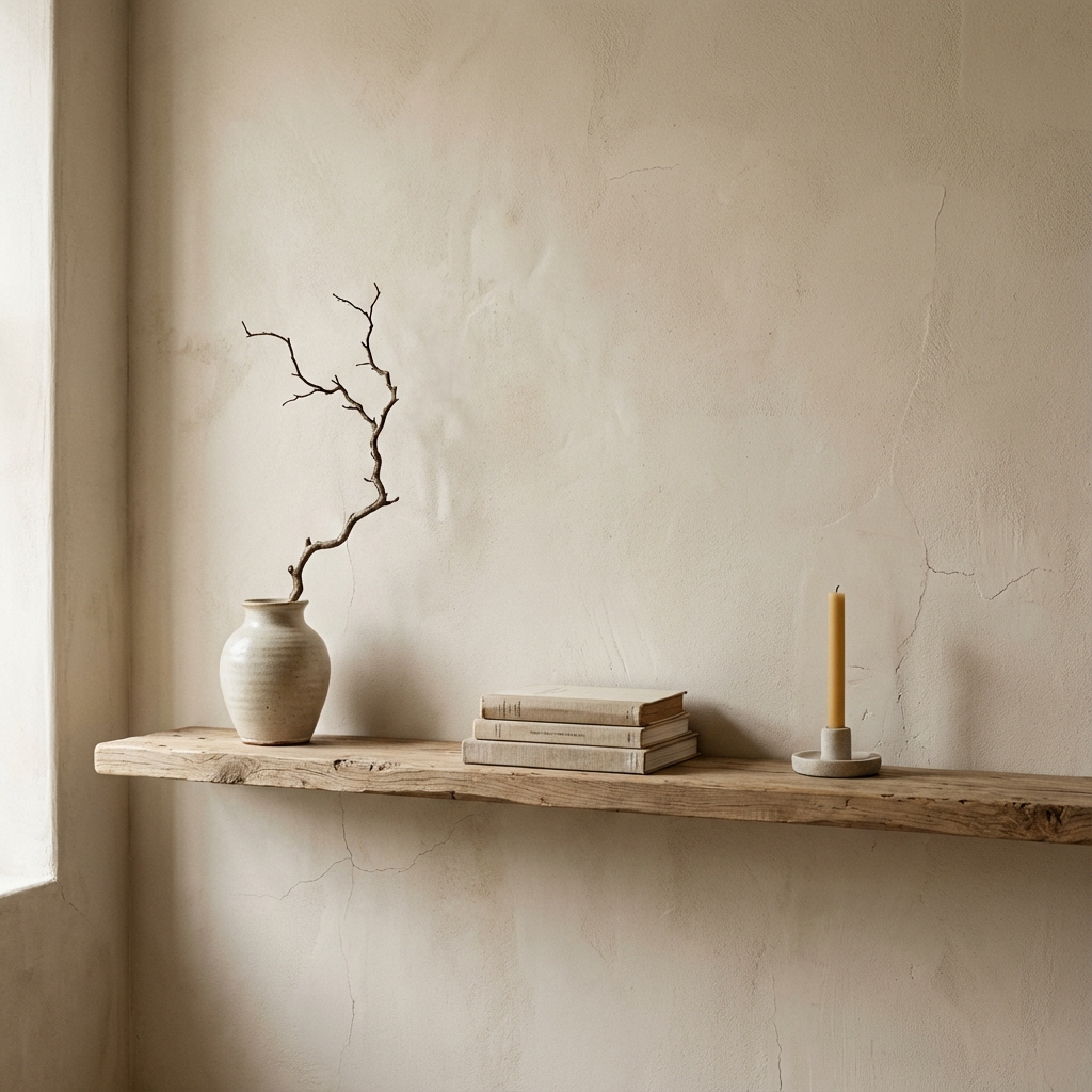
Wabi-Sabi Styling: Celebrating imperfection and space. A "Zen Zone" relies on a single organic element to create calm.
Dedicate one shelf (usually at eye level) to pure calm. No books, no clutter. Just a candle, a rock, or a single beautiful branch. This is your visual resting point.
Summary: 5 Mistakes to Avoid
- ❌ The Line-Up: Pushing every book to the back of the shelf. (Pull them forward for a full look).
- ❌ The Brick Wall: Stacking books too effectively without breathing room. (Add negative space).
- ❌ The Lonely Object: Placing tiny objects on huge shelves. (Group them in threes or on trays).
- ❌ The Heavy Top: Putting the biggest vase on the top shelf. (Put it on the bottom as an anchor).
- ❌ The Dark Hole: Forgetting lighting. (Add a puck light or a lamp).
Final Thoughts
A great bookshelf is never "finished." It evolves with your reading habits and your life. Start with the Anchor Pieces (A) to get the structure right, use the S-Curve (S) to place your decor, and finish with Editing (E).